
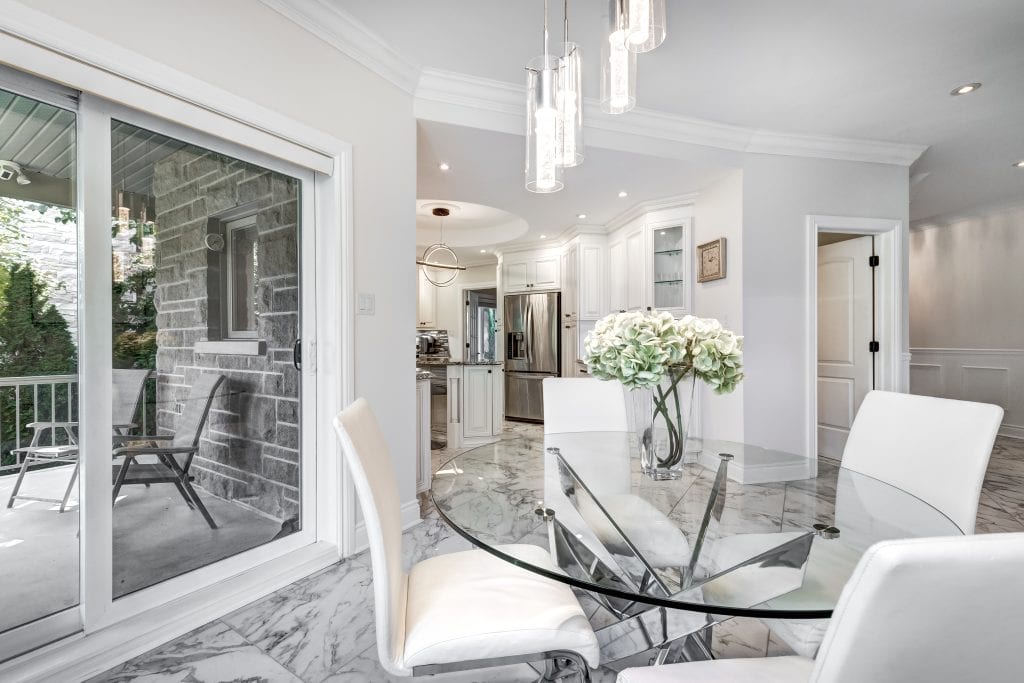
How Colour Psychology Affects the Feel of Your Home
Paint colour can change how warm, calm, bright, intimate, spacious or visually balanced a room feels. Two rooms with similar dimensions can create very different impressions when one is painted in a pale cool neutral and the other in a deep warm terracotta.
Colour psychology in interior design is useful because colour affects perception. It is not, however, a fixed formula. A blue bedroom does not make every person feel calm, and a red dining room does not automatically make every household feel energised. Personal preference, culture, natural light, furniture, flooring, architecture and the way a room is used all influence the final experience.
Direct answer: Colour psychology in interior design is the practical study of how colours influence the perceived atmosphere, scale, warmth and energy of a room. The most successful colour choice is one that works with the room’s light, undertones, architecture, fixed finishes and intended use rather than relying on a universal colour rule.
This is particularly relevant in Gardens and the wider City Bowl, where interiors range from Victorian and Edwardian homes with high ceilings and decorative details to compact apartments with open-plan layouts, large windows and strong mountain or urban views.
Protective Coatings Cape Town assists with suitable interior painting projects through our Painters Gardens, City Bowl Painters and Interior Painters Cape Town services.
What Is Colour Psychology in Interior Design?
Colour psychology in interior design examines how colour affects the way people perceive and experience an interior. It considers whether a room feels visually warmer or cooler, brighter or darker, open or enclosed, calm or energetic.
The effect comes from more than the colour name. A muted terracotta, bright orange-red and dusty pink may all be described as warm colours, but they produce very different results because of their intensity, undertone and relationship with the rest of the room.
Colour should therefore be considered alongside:
- Natural-light direction
- Artificial-light colour and intensity
- Room size and ceiling height
- Paint finish and sheen
- Flooring, tiles and countertops
- Curtains, furniture and fabrics
- Architectural features
- The room’s intended use
- Personal taste and cultural associations
Colour Psychology Is a Guide, Not a Guarantee
Statements such as “blue is calming” or “yellow is cheerful” can provide a useful starting point, but they oversimplify how real homes work.
A pale blue-green may feel fresh and relaxed in a bright north-facing room. The same colour can feel grey, cold or flat in a shaded south-facing passage. Deep green may feel elegant in a heritage living room with timber floors, but overly heavy in a poorly lit apartment with cool flooring and no visual contrast.
The question should not only be, “What feeling is associated with this colour?” It should also be:
- What undertone does the colour have?
- How much light reaches the room?
- What colour is the flooring?
- How high is the ceiling?
- What happens to the colour at night?
- Does the room need to feel open, intimate or connected to another space?
How Different Colour Families Affect a Room
| Colour family | Typical visual effect | Possible limitation |
|---|---|---|
| Warm colours | Can feel welcoming, intimate, grounded or energetic | Strong versions may overwhelm a small or poorly lit room |
| Cool colours | Can feel calm, fresh, spacious or visually restful | May appear cold or flat in shaded rooms |
| Warm neutrals | Can feel versatile, comfortable and complementary to timber | Yellow or pink undertones may clash with cool tiles and stone |
| Cool neutrals | Can feel contemporary, clean and restrained | May look blue, green or violet in certain light |
| Dark colours | Can add depth, drama, intimacy and definition | Show uneven preparation, patching and inconsistent sheen |
| Light colours | Can reflect more light and make surfaces feel visually open | Pure white can create glare or feel flat without contrast |
Warm Colours: Terracotta, Ochre, Red and Warm Pink
Warm colour families include terracotta, rust, ochre, mustard, warm yellow, coral, warm pink and many reds. These colours tend to advance visually, which can make a room feel more intimate and connected.
They can work particularly well in Gardens homes with:
- Natural timber flooring
- Fireplaces
- Exposed brick or stone
- High ceilings
- Warm-white lighting
- Dining and social areas
A muted terracotta can feel grounded and welcoming in a heritage living room, while a dusty warm pink may soften a bedroom without appearing overly decorative.
Intensity matters. A strong red used on every wall can dominate a compact room. A softer, earthier version or a controlled accent may produce a more balanced result.
Cool Colours: Blue, Sage and Blue-Green
Cool colours include many blues, blue-greens, sage greens, cooler greys and muted aqua tones. They often recede visually, which can help a room feel more open or settled.
Cool colours can suit:
- Bright north-facing rooms
- Bedrooms
- Home offices
- Compact apartments
- Rooms with warm timber or brass details
- Spaces with strong afternoon heat or glare
The main risk is that an already cool or shaded room may feel colder. Warm flooring, textiles, lamps and timber furniture can help balance a cool wall colour.
Neutral Paint Colours Are Not Colourless
White, cream, beige, greige, taupe and grey are often treated as safe choices, but every neutral has an undertone.
A white may lean:
- Warm yellow
- Soft pink
- Cool blue
- Subtle green
- Grey or violet
A warm white can look comfortable beside oak flooring but unexpectedly creamy next to cool marble. A grey with a green undertone may work with natural stone but appear muddy beside pink-beige tiles.
Neutral colours should therefore be selected in relation to permanent finishes, not in isolation.
What Is a Paint Undertone?
An undertone is the subtle colour bias beneath the main colour. It may not be obvious on a small card, but it becomes clearer when the paint is applied over a larger area or placed beside another material.
Common undertones include:
- Yellow
- Pink or red
- Green
- Blue
- Violet
- Warm brown
Undertones explain why two greys can look completely different in the same room. One may appear soft and warm, while the other becomes noticeably blue under cool evening lighting.
Before choosing a neutral, compare it with:
- Timber floors
- Tiles
- Stone or quartz countertops
- Kitchen cupboards
- Curtains
- Sofas and large furnishings
- Existing trim and ceilings
Do Dark Colours Make Rooms Look Smaller?
Not always. Dark colours can make boundaries feel less distinct, especially when walls, trim and ceilings are painted in related tones. This can create depth rather than simply making the room feel smaller.
Charcoal, deep green, navy, aubergine and dark brown can work well in:
- Bedrooms intended to feel cocooning
- Heritage dining rooms
- Libraries and home offices
- Rooms with high ceilings
- Spaces with decorative cornices or fireplaces
- Selected walls in open-plan interiors
Dark colours require excellent preparation. Filled cracks, patch repairs, roller marks and uneven sheen can become more visible, particularly under side lighting from large City Bowl windows.
How Light Colours Affect an Interior
Light colours generally reflect more visible light and can help a compact or shaded room feel brighter. Soft whites, pale greiges and light neutral tints are therefore popular in apartments.
More reflected light does not automatically produce a more comfortable room. A brilliant white used across walls and ceilings in a sun-filled apartment may create glare and strong contrast with dark windows or mountain views.
A slightly softened white or pale neutral can provide brightness without appearing stark.
Light Reflectance and Colour
Paint colours are sometimes compared using Light Reflectance Value, or LRV. This indicates how much visible light a colour reflects relative to darker and lighter colours.
A higher-reflectance colour can help distribute available light, but LRV should not be used as the only selection tool. Undertone, sheen, window size, artificial lighting and surrounding finishes still influence how the room feels.
A pale cool grey with a relatively high reflectance may still feel cold in a shaded room, while a slightly darker warm neutral may feel more comfortable.
Natural-Light Direction in Cape Town Homes
Because Cape Town is in the Southern Hemisphere, north-facing rooms generally receive warmer and more consistent sunlight. South-facing rooms usually receive cooler, more indirect light.
| Room direction | Typical light character | Colour considerations |
|---|---|---|
| North-facing | Warmer, brighter and more consistent daylight | Can support cooler neutrals, blue-greens and deeper colours |
| South-facing | Cooler, more indirect light | Warm whites, creams and balanced greiges may prevent a cold appearance |
| East-facing | Warm morning light and cooler later light | Test the colour in both bright morning and subdued afternoon conditions |
| West-facing | Strong, warm afternoon sunlight | Warm colours may intensify considerably late in the day |
| Limited natural light | Low and often inconsistent illumination | Choose undertones carefully and test with the final artificial lighting |
Artificial Lighting Can Change the Paint Colour
Paint that looks balanced during the day can appear different at night. Artificial lighting affects both colour temperature and contrast.
Warm-white lighting generally strengthens warm undertones and can soften blue, green and grey colours. Cooler-white lighting may make warm colours look less saturated and cool neutrals appear sharper, greyer or more clinical.
Other factors include:
- The colour temperature of LED globes
- Whether light is direct or diffused
- The position of downlights
- Shadows created by wall lights
- Light reflected from flooring or cabinetry
- The brightness of screens and televisions
Always assess paint samples under the lighting that will actually be used in the room.
How Colour Changes the Perceived Size of a Room
Colour can alter the way room proportions are perceived.
- Light walls can make boundaries feel more distant.
- Darker end walls can visually shorten a long passage.
- A darker ceiling can make a very tall room feel more intimate.
- Walls and ceilings in the same colour can reduce strong visual divisions.
- Contrasting trim can emphasise windows, doors and architectural edges.
- Continuous colour across an open-plan area can improve visual flow.
These are visual tendencies rather than strict rules. Furniture scale, lighting and floor pattern also affect perceived space.
Should a Ceiling Always Be White?
No. White remains a practical ceiling colour because it reflects light and provides familiar contrast, but it is not the only suitable choice.
Options include:
- A softer version of the wall colour
- The same colour as the walls
- A pale warm neutral instead of brilliant white
- A deeper ceiling colour in a very tall heritage room
- A contrasting colour that highlights cornices or ceiling details
Painting the ceiling and walls in one colour can create a continuous, enveloping effect. In a low room, reduced contrast between wall and ceiling may also make the division less obvious.
Colour Planning for Gardens Heritage Homes
Gardens includes Victorian and Edwardian houses, heritage cottages and older apartments with features such as:
- Decorative cornices
- High ceilings
- Sash windows
- Timber floors
- Fireplaces
- Dado rails
- Picture rails
- Deep skirtings and architraves
A heritage interior does not need to be painted in historically dark or traditional colours to respect its architecture. Contemporary palettes can work well when they acknowledge the building’s proportions and details.
Useful approaches include:
- Using one main neutral with deeper colours in selected rooms
- Highlighting cornices and trim with controlled contrast
- Choosing wall colours that complement timber floors
- Using a deeper colour around a fireplace
- Painting dado or panelled areas separately
- Avoiding brilliant white on every surface when it flattens detail
Older walls also need careful preparation. Historic cracking, previous repairs, damp, unstable paint layers and uneven plaster can become more visible after a colour change.
Colour Planning for Small City Bowl Apartments
Compact apartments benefit from visual consistency. Too many feature walls and competing colours can divide an already small footprint.
Practical approaches include:
- Using one continuous base colour across open-plan living areas
- Creating colour zoning through one controlled accent
- Repeating undertones across adjoining rooms
- Using trim and ceilings to maintain flow
- Connecting the palette to mountain, city or garden views
- Using furniture and textiles for more easily changed colour
A dark colour can still work in a small apartment, particularly in a bedroom, alcove or wall with strong daylight. The important issue is how the full palette is balanced.
Choosing Colours for Different Rooms
Living Rooms
Living rooms need to work in both daylight and evening light. Warm neutrals, muted greens, gentle earth tones and balanced greiges can provide a versatile base. Deeper colours may work on selected walls or throughout a well-lit heritage room.
Bedrooms
Bedrooms often suit softer, lower-intensity colours. Muted blues, sage, warm greige, dusty pink and deep cocooning shades can all work depending on light and personal preference.
Kitchens
Kitchen wall colours should work with cabinetry, countertops, splashbacks, flooring and task lighting. Undertones that conflict with fixed finishes become particularly obvious in a kitchen.
Bathrooms
Bathroom colour should be considered together with moisture resistance, extraction and the existing tiles and sanitaryware. Pale colours can feel clean and open, while deeper colours can provide contrast in a well-lit bathroom.
Home Offices
Home offices often benefit from colours that limit glare and do not compete strongly with screens. Mid-tone neutrals, muted green, blue-grey and restrained warm shades can work well.
Passages
Passages frequently receive limited natural light. A lighter base colour can improve continuity, while a darker end wall may visually shorten a long corridor.
Guest Rooms
Guest rooms generally benefit from a broadly appealing palette that works with different bedding and furnishing choices.
Rental Properties
Rental homes often suit durable, balanced neutrals with clear colour records for future maintenance. Pure white is not always the easiest option because scuffs and glare can become more visible.
Paint Finish and Sheen Affect the Final Colour
The same colour can appear different in matt, low-sheen and satin finishes because each reflects light differently.
| Finish | Typical appearance | Practical consideration |
|---|---|---|
| Matt | Soft, low reflection and colour-rich | Helps disguise minor imperfections but product washability varies |
| Low sheen | Subtle reflection with a balanced wall finish | Often suitable for living areas and general interior walls |
| Satin | More reflected light and slightly deeper colour appearance | More washable but highlights surface defects |
| Higher sheen | Strong reflection and defined highlights | Useful selectively on trim or demanding areas but requires excellent preparation |
Bathrooms, kitchens and high-traffic areas normally require attention to washability and moisture exposure, not simply colour.
Why Paint Samples Must Be Tested Properly
A small printed colour card cannot accurately represent how paint will look across an entire room.
A useful testing process includes:
- Select a small group of realistic colour options.
- Apply each colour to a large sample board or wall area.
- Use at least approximately one square metre where practical.
- Test the colour on more than one wall.
- View it in morning, midday and afternoon light.
- View it under the room’s evening lighting.
- Compare it with flooring, tiles, counters and furniture.
- Check how it looks beside the ceiling and trim colour.
- Observe the sample for several days before deciding.
Movable sample boards can be useful because they allow the colour to be placed against different walls and fixed finishes without creating several test patches.
Common Interior Colour-Selection Mistakes
- Choosing from a small colour card only
- Ignoring undertones
- Selecting paint under shop lighting
- Ignoring flooring, tiles and countertops
- Using brilliant white everywhere without considering glare
- Assuming dark colours always make rooms smaller
- Creating too many feature walls
- Ignoring the ceiling colour
- Choosing sheen without considering wall defects
- Using cool colours in already cold, shaded rooms without balance
- Using strong warm colours without considering afternoon sun
- Following a trend that does not suit the architecture
- Failing to keep accurate colour records for future touch-ups
- Painting over cracks, mould, stains or damp
Preparation Comes Before Colour
Even a carefully selected colour will look poor when applied over damaged or badly prepared walls.
Interior preparation may include:
- Checking for active damp
- Treating mould
- Repairing cracks
- Removing loose coatings
- Testing older paint for adhesion
- Filling and sanding defects
- Blocking water, rust or tannin stains
- Priming repaired or porous areas
- Protecting timber floors, furniture and fittings
- Checking completed repairs under side lighting
Paint does not repair active moisture. Where bubbling, mould or recurring staining is present, our Damp Proofing Cape Town service may help determine what must be addressed before the colour scheme is applied.
Colour Planning for Rentals and Guesthouses
Gardens and the City Bowl contain rental apartments, guesthouses and short-term accommodation where colour choices must support maintenance as well as appearance.
Practical considerations include:
- Broad appeal to different occupants
- Durable and washable finishes
- Easy colour matching
- Consistent palettes between rooms
- Avoiding overly trend-dependent schemes
- Using furnishings for easily changed accent colours
- Keeping written records of colours and products
Body corporate rules may also restrict colours on common areas, entrance doors, balconies or externally visible elements. Approval should be confirmed before work begins where applicable.
Related services include Residential Painters Cape Town, Commercial Painting and Body Corporate and Estate Painting.
How Protective Coatings Cape Town Approaches Interior Painting
Protective Coatings Cape Town is not a lead-generation company. Clients deal directly with an established painting contractor responsible for assessing and completing suitable projects.
Our approach includes:
- A diagnostic assessment of visible wall and coating defects
- A written diagnostic report with the quotation
- A clear written scope of preparation and painting
- Full-time employed painters rather than casual subcontracted teams
- A working foreman supervising preparation and quality
- Public Liability Insurance through OUTsurance
- Supplier or manufacturer-backed specifications where applicable
- Honest identification of limitations and exclusions
- Recognition that paint does not repair active damp
View our complete Cape Town Painting Services directory for related services.
Interior Painters Serving Gardens and Nearby City Bowl Areas
Protective Coatings Cape Town assists with suitable interior painting projects in Gardens and surrounding City Bowl suburbs, subject to project scope, access and scheduling.
- Painters Tamboerskloof
- Painters Oranjezicht
- Painters Vredehoek
- Painters Higgovale
- Painters De Waterkant
- Painters Woodstock
View the complete Cape Peninsula Painting Service Areas directory.
Request a Gardens Interior Painting Quotation
Call Protective Coatings Cape Town on 061 235 6768 or use our Contact Us page to request an inspection and written quotation for a suitable Gardens or City Bowl interior painting project.
Frequently Asked Questions About Colour Psychology
What is colour psychology in interior design?
Colour psychology in interior design examines how colour influences the perceived atmosphere, scale, warmth and energy of an interior. It is a practical guide rather than a guarantee of a particular emotional response.
Can paint colour affect how a room feels?
Yes. Colour can influence whether a room feels visually warm, cool, calm, energetic, open or intimate. Light, architecture, furnishings and personal preference also affect the result.
What colours make a room feel warmer?
Terracotta, ochre, warm yellow, rust, coral and warm pink can make a room feel visually warmer and more intimate.
What colours can make a room feel calmer?
Muted blues, blue-greens, sage, soft neutrals and lower-intensity colours often support a calmer atmosphere, although personal preference remains important.
Do dark colours make rooms look smaller?
Not always. Dark colours can add depth and create a cocooning effect. Their success depends on lighting, room proportions, furnishings and how ceilings and trim are treated.
What colours work well in a small apartment?
Light neutrals can help reflect available light, while continuous colour across open-plan spaces can improve flow. Selected dark or mid-tone colours can also work when used deliberately.
What is a paint undertone?
An undertone is the subtle colour bias beneath the main colour, such as yellow, pink, green, blue or violet. It becomes more obvious beside flooring, tiles and other fixed finishes.
Why does paint look different on the wall?
Natural light, artificial lighting, surrounding materials, wall direction, sample size and paint sheen can all change how a colour appears.
What colours work in north-facing rooms in Cape Town?
North-facing rooms generally receive warmer, more consistent sunlight and can often support cooler neutrals, blues, greens and deeper colours.
What colours work in south-facing rooms?
South-facing rooms usually receive cooler, indirect light. Warm whites, creams, warm greiges and balanced neutral colours can help prevent the room feeling cold.
How does artificial lighting affect paint colour?
Warm-white lighting strengthens warm undertones, while cooler-white lighting can make colours look sharper, greyer or more blue. Samples should be checked under the room’s actual lights.
What is Light Reflectance Value?
Light Reflectance Value indicates the relative amount of visible light a colour reflects. It is useful for comparison but should be considered together with undertone, sheen and actual room lighting.
Should the ceiling always be white?
No. Ceilings may be painted in softened white, a lighter version of the wall colour, the same colour as the walls or a deeper contrasting shade depending on the room’s proportions.
What colours suit heritage homes?
Heritage homes can support warm neutrals, muted greens, earth tones, deeper feature colours and contemporary palettes that respect timber floors, fireplaces, cornices and sash windows.
What is the best finish for living-room walls?
Matt and low-sheen finishes are commonly used because they provide a soft appearance and help disguise minor surface imperfections. Washability requirements should also be considered.
What paint finish is suitable for bathrooms?
Bathrooms normally require a washable, moisture-resistant coating suited to humid conditions. Good extraction and treatment of existing mould are also important.
Should I test paint samples before choosing?
Yes. Large samples should be viewed on different walls, at different times of day and under the room’s evening lighting.
How large should a paint sample be?
A sample of approximately one square metre is useful where practical. A large movable sample board can also help compare the colour on different walls.
What colours work well in rental properties?
Balanced neutrals, soft tones and durable washable finishes generally provide broad appeal and make future maintenance and colour matching easier.
Must cracks and damp be repaired before painting?
Yes. Active damp, mould, cracks, loose paint and unstable plaster should be addressed before applying the final colour and finish.
How do I request a Gardens painting quotation?
Call Protective Coatings Cape Town on 061 235 6768 or use the Contact Us page to request an inspection and written quotation.